Found Cruz design system

Challenge

Standardize design practices across the organization to improve efficiency and scalability.

Screenshot showing a banking app interface on a computer and smartphone displaying accounts, balances, recent activities, and options for managing money.
Circular design with the phrase 'Found weight found' arranged around a central pattern of asterisks.

Solution

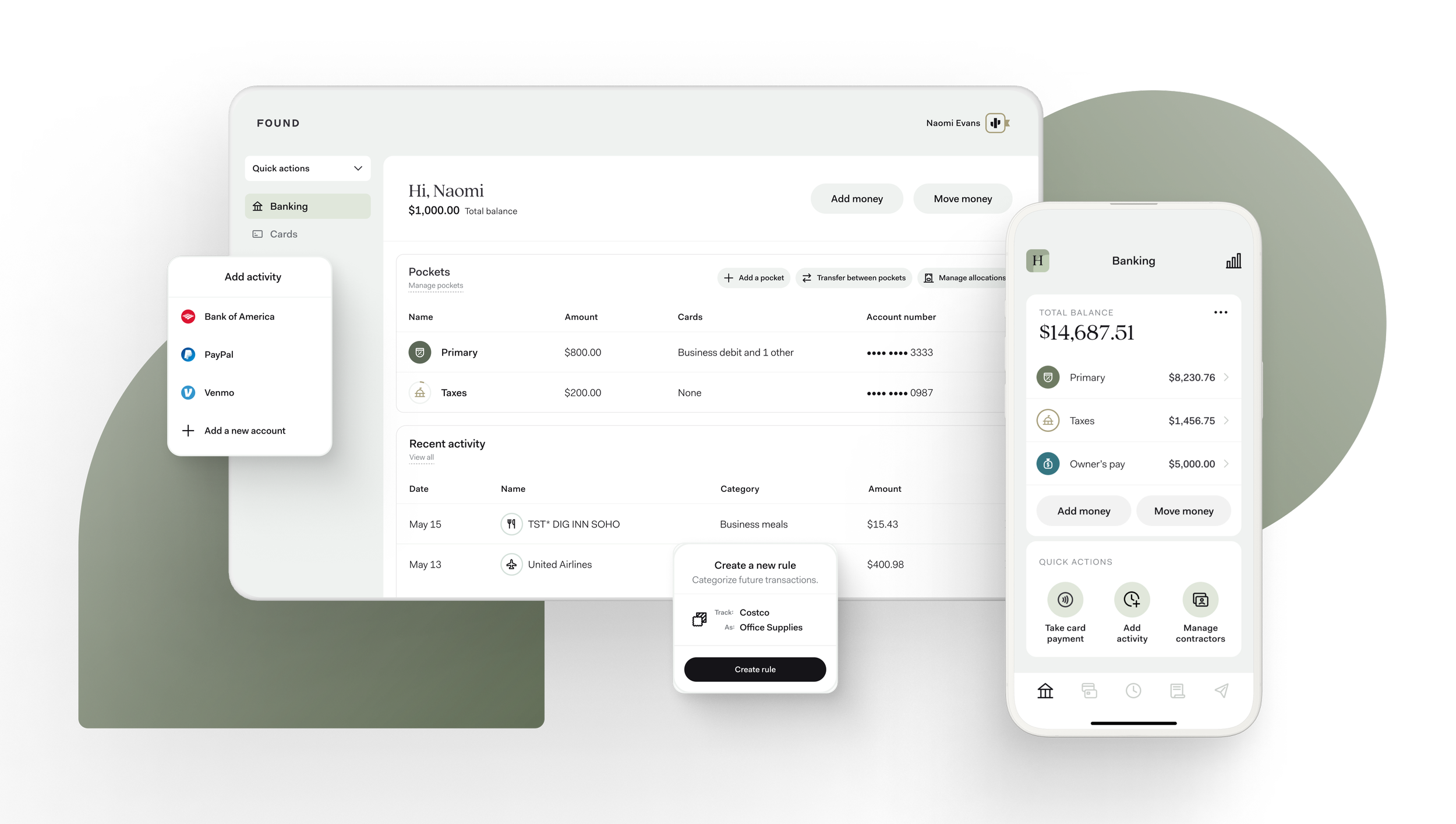
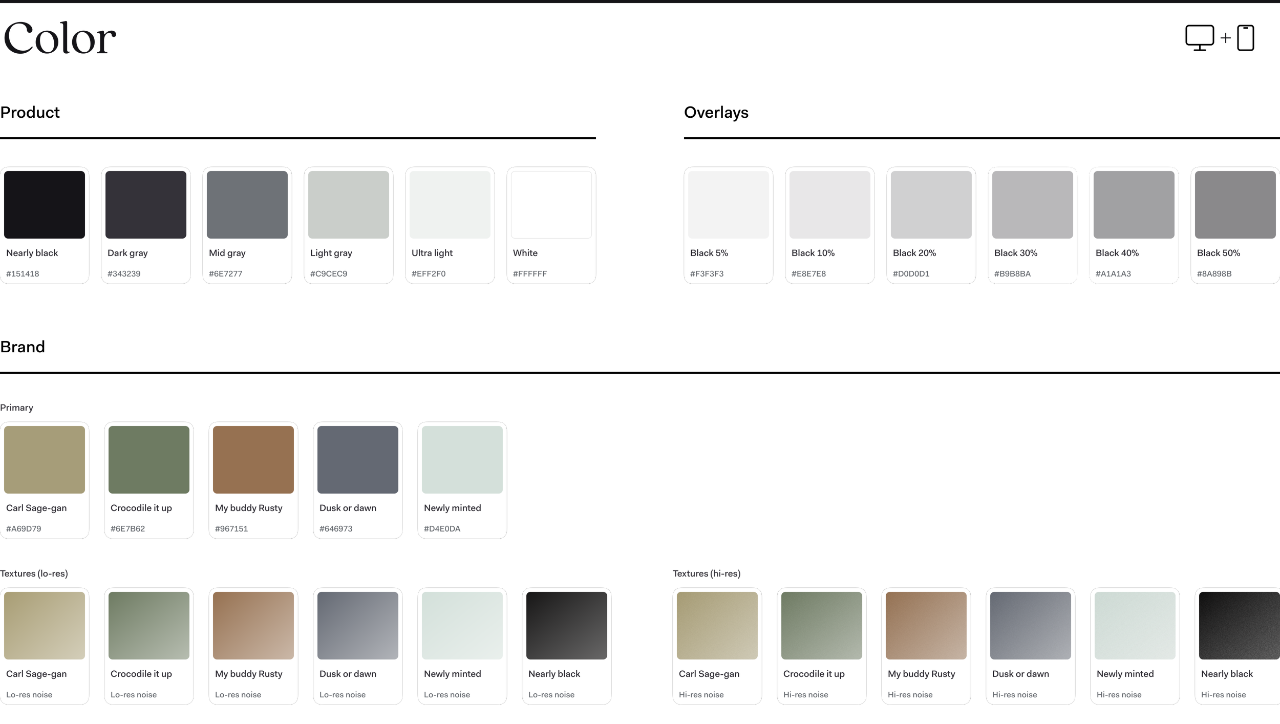
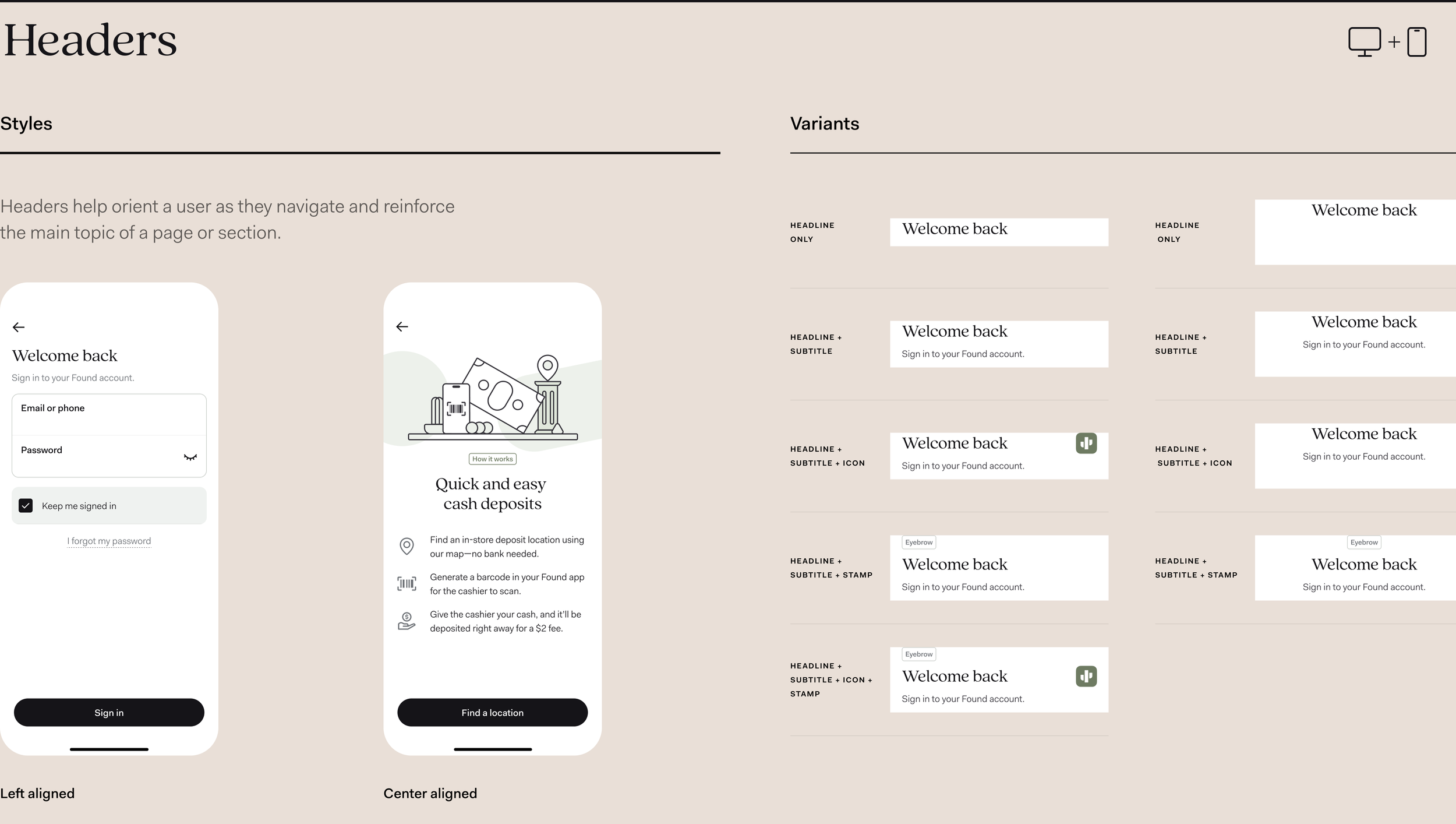
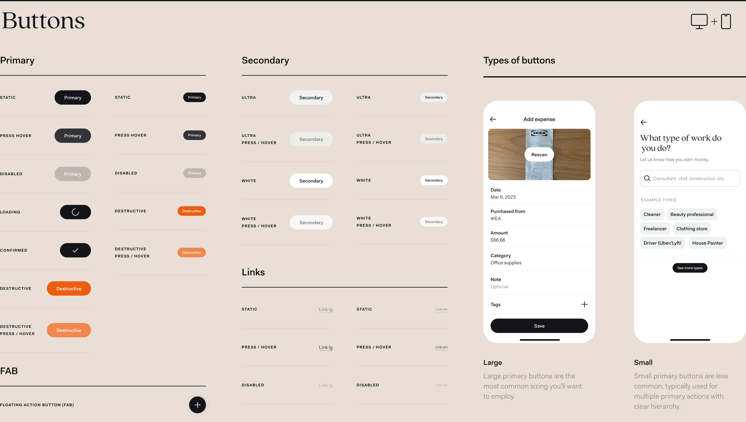
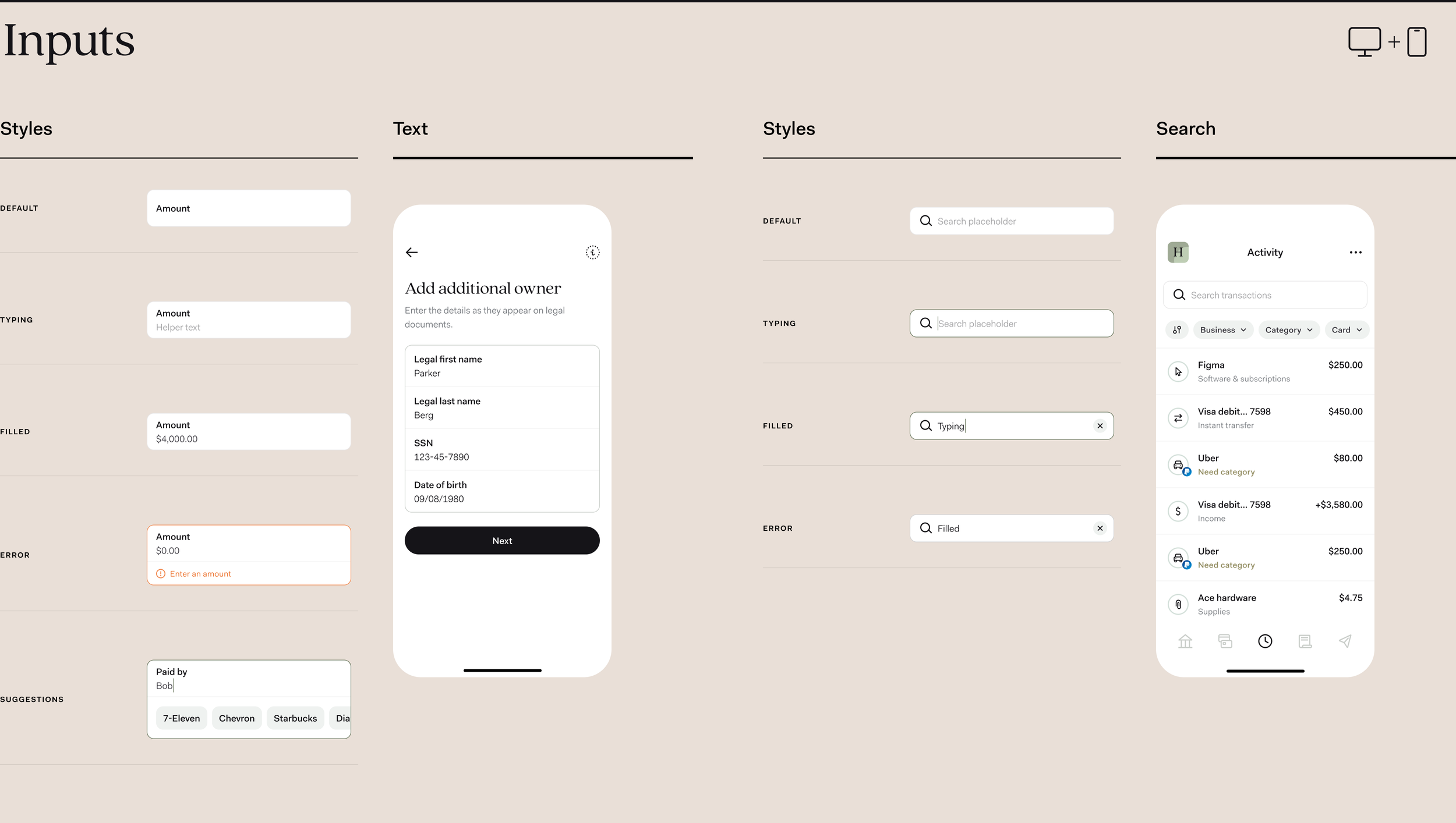
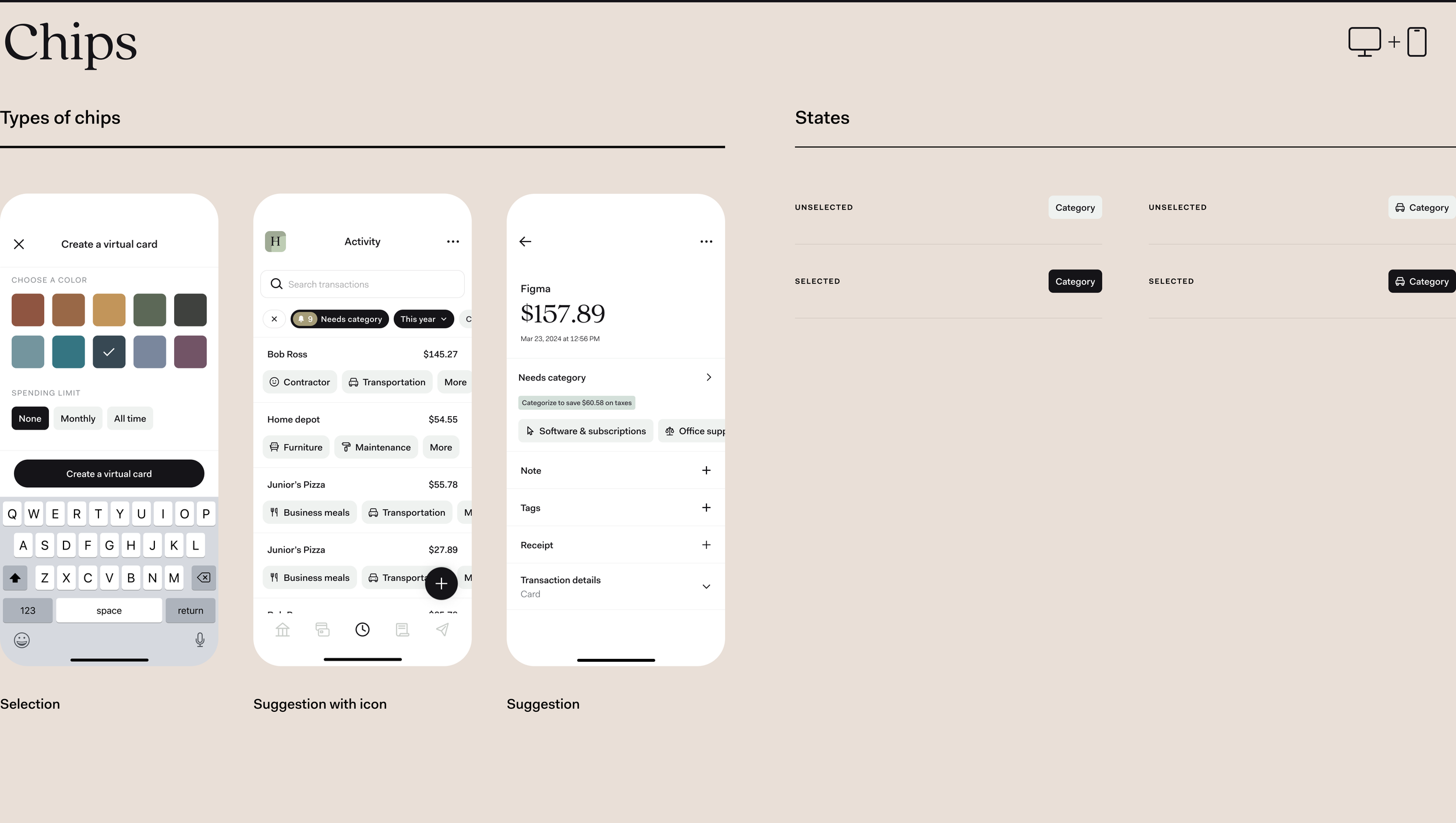
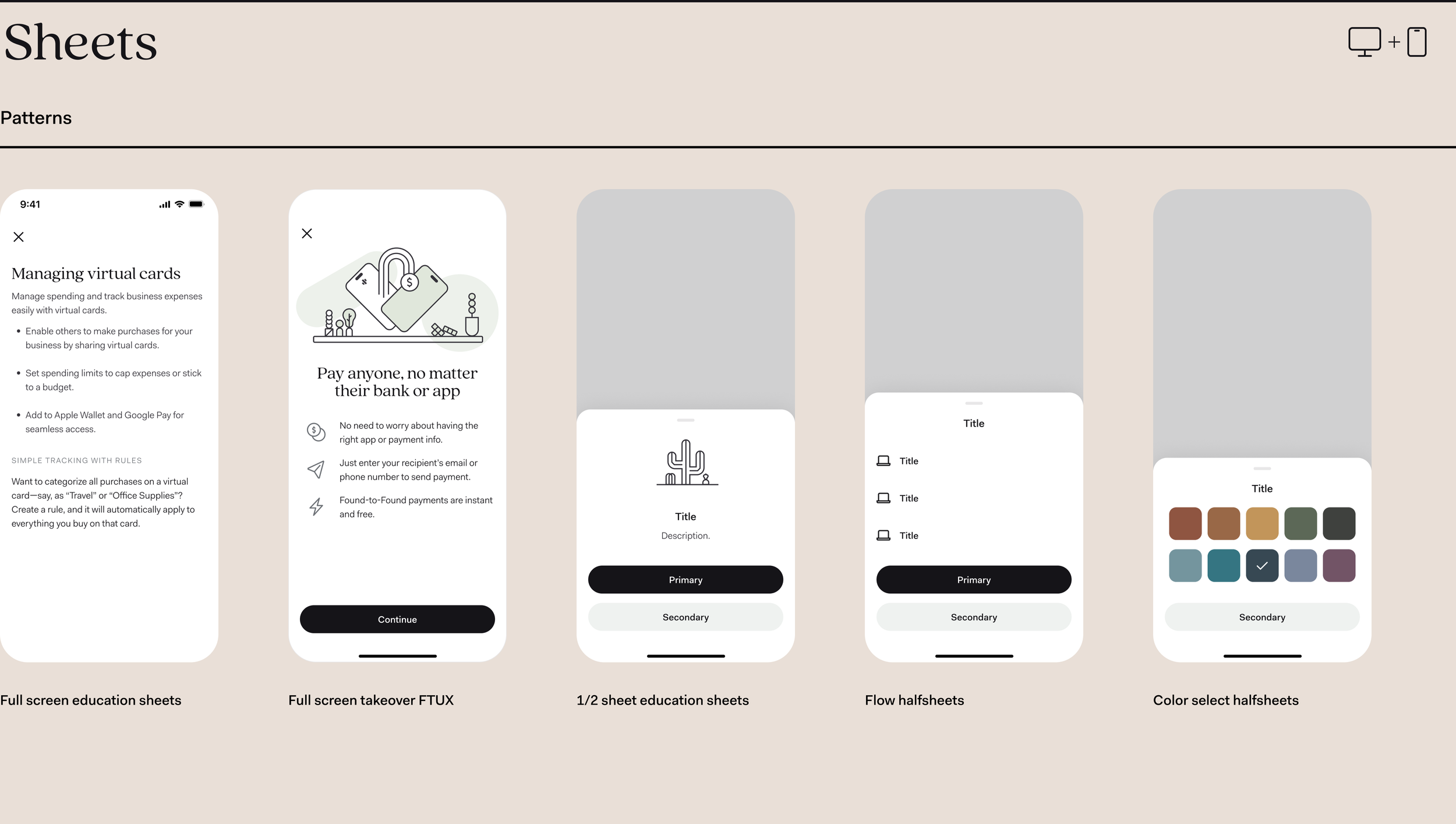
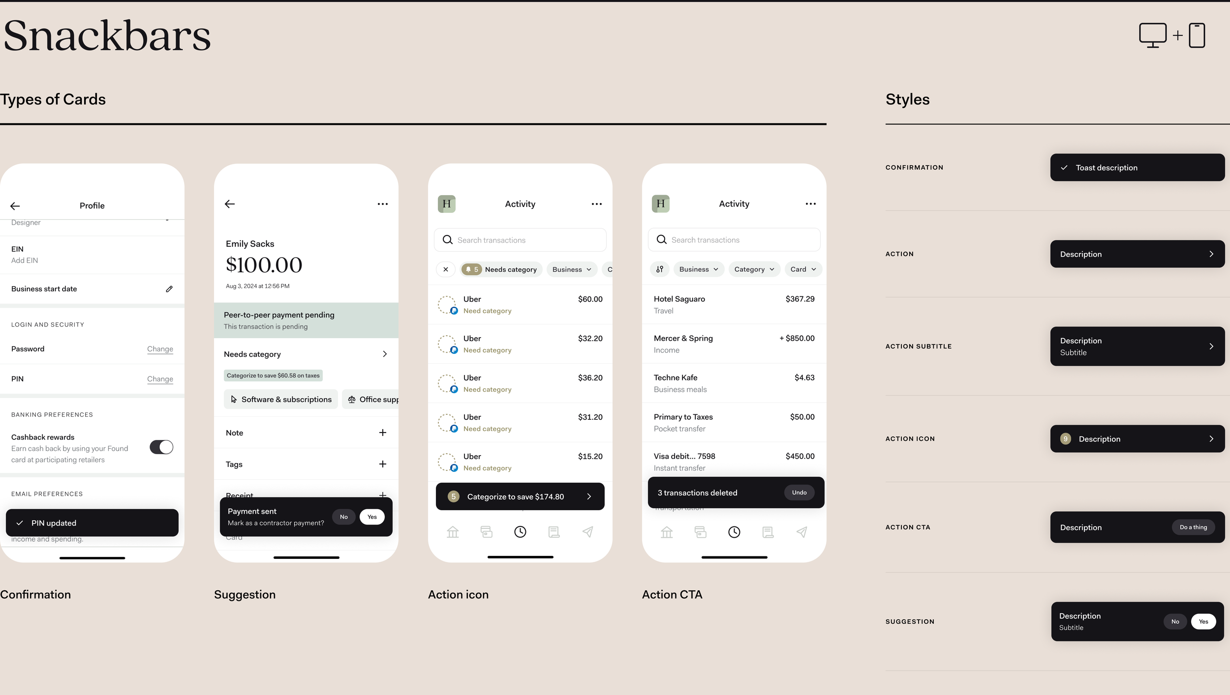
Create a centralized design system, "Cruz," to streamline the design process, enhance consistency, and accelerate time-to-market. Some key components of the system are below.

Overview of typography styles, including fonts like Quincy, with details on sizes and weights for headlines, body text, and captions.
Color palette with various shades of gray, black, and green, including labeled color names and hex codes.
A color palette and data visualization chart. The palette includes sections for rewards, banking, bookkeeping, and generic messages with various shades of green, brown, gray, and beige. The data visualization section features green and chart colors with shades of brown, yellow, green, and gray, alongside system colors marked as positive in green and negative in orange.
A chart displaying various icon categories in different sizes, including 16x16, 24x24, and 32x32, with the word 'Iconography' at the top.
Design templates for headers in UI design, showing styles and variants with different text arrangements and icons, on a beige background.
Screenshot of a webpage titled 'Avatar' with three sections displaying different mobile app interfaces. The first section shows a contact card for Ash Parker with buttons to edit contact and pay. The second section shows a payment app screen with details for Naomi Evans, including routing number, account number, and a payment of $79.98 to Tim's Apple Repair. The third section shows a financial app with transaction details, subscription savings, and tags. On the right, a comparison chart of avatar variants illustrating different icon styles for default, member, photo, circle outline and filled, square outline and filled icons.
Design layout of buttons and user interface elements including categories like primary, secondary, and types of buttons with examples; also shows a mobile app UI for adding expense with details, and a question about work types with suggested tags and 'see more' button.
Screenshot of a digital interface showing tags and their statuses, with two mobile phone screens displaying financial transaction details and tag management options.
Screenshots of a user interface design displaying form fields for inputs, styles, search, and transaction activity, with mobile and desktop views.
Screenshots of a digital financial management app showing different views: a list of transactions including activities like Uber and Visa, a checklist for bank transactions, an action group with transaction details from Bank of America, and style options for subtitles and categories.
Collection of mobile app interface screens showing financial management features including payments, rules, and tags with options to add and manage different transactions and categories.
Screenshot of a digital card management app displaying different card styles, including cashback rewards, business, banking, and expense tracking, on a mobile device.
Mobile screens displaying payment settings, including payment methods, deposit options, and card management features.
A digital interface displaying a project related to chips, with sections showing different app screens for creating virtual cards, transaction activity, and expense categories.
Collection of five mobile app design screens showcasing different styles of digital sheets, including full screen education sheets, full screen takeover, half sheets, flow halfsheets, and color select halfsheets, on a beige background.
A sequence of five mobile app screen mockups showcasing different UI designs: confirmation dialog, multi-level half sheet, upsell half sheet education screens, upsell half sheets, and comments half sheets, each with labels and example content.
Design mockup of a mobile and desktop interface for a snackbars application, displaying various screens including profile, transactions, activity, with labeled elements like cards, buttons, and icons for user interaction and settings.
Comparison of mobile and desktop interface designs for a banking application, showing account balance, transaction options, and navigation icons.
Comparison of mobile and desktop interface designs for a tab management system, showing different layout styles and states.
Screenshot of a user interface titled 'Blade' with a sidebar menu including options like Banking, Cards, Taxes, Activity, Reports, Invoices, Payments, Contractors, and Toolkit. The main section displays a list of invoices with dates, recipients, and amounts, along with selection options labeled 'Secondary' and 'Primary' at the bottom.
Screenshot of a digital app interface showing an invoice management system with a sidebar menu including options like Banking, Cards, Taxes, Activity, Reports, Invoices, Payments, Contractors, and Toolkit, alongside a list of invoices with details such as date, recipient, and amount.

Impact

By establishing a shared design language, we empower teams to work efficiently, reduce errors, and deliver exceptional user experiences. This leads to a stronger brand identity, cost savings, and increased productivity across the organization.

Curious? Dive into the details.

Discover

Define

Develop

Deliver

Discover • Define • Develop • Deliver •

Role


Systems design, product design, illustration

Collaboration

Natalie Harper, Yuri Lee, Robert Murdock, Dave Richard, Shayne Sing, Patrick Smith, Chip Truex