
Found — Brand refresh
Challenge
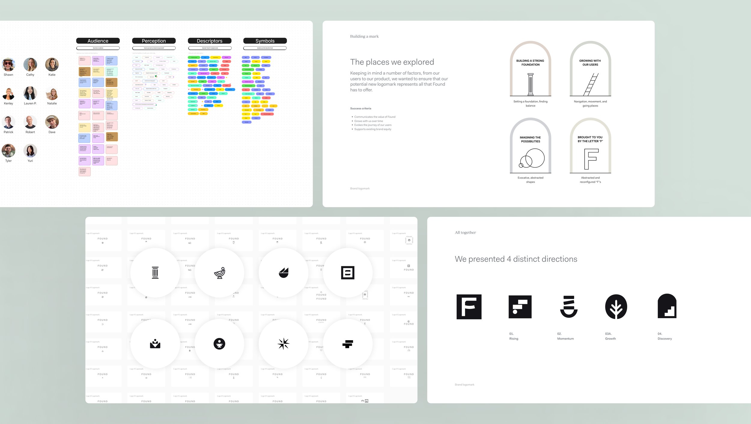
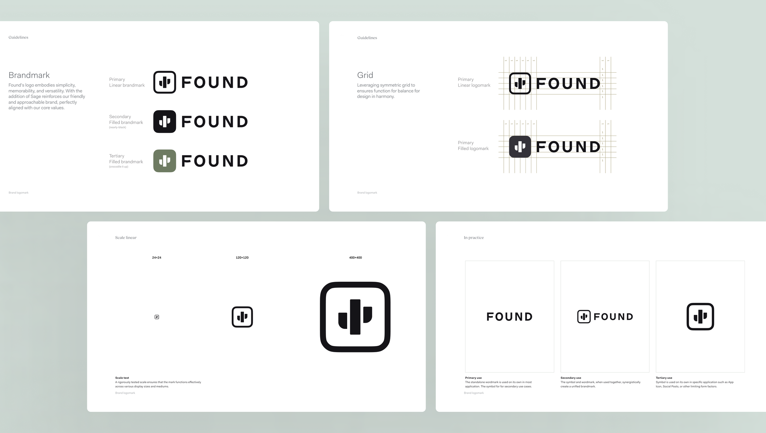
Our current logomark is losing impact due to lack of differentiation, scalability, and emotional connection. It fails to effectively represent the brand's evolving identity and values.


Solution
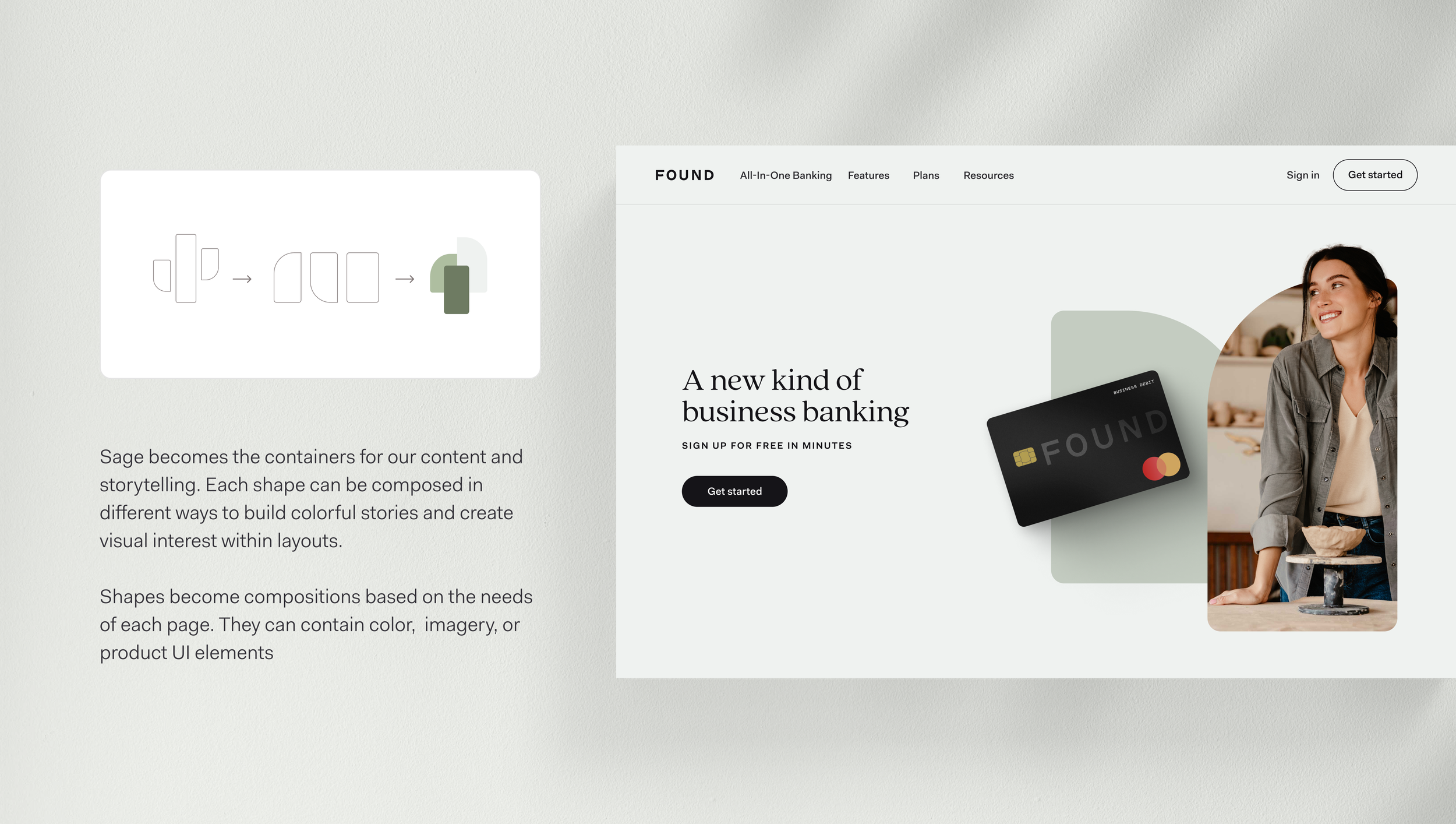
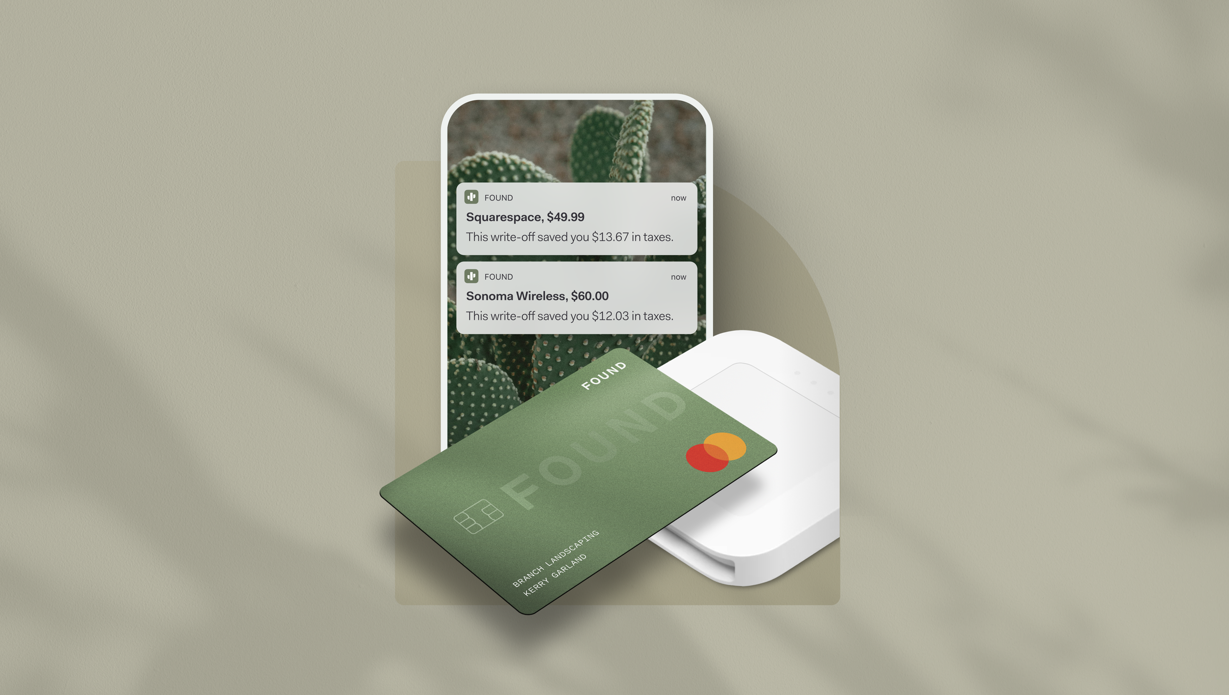
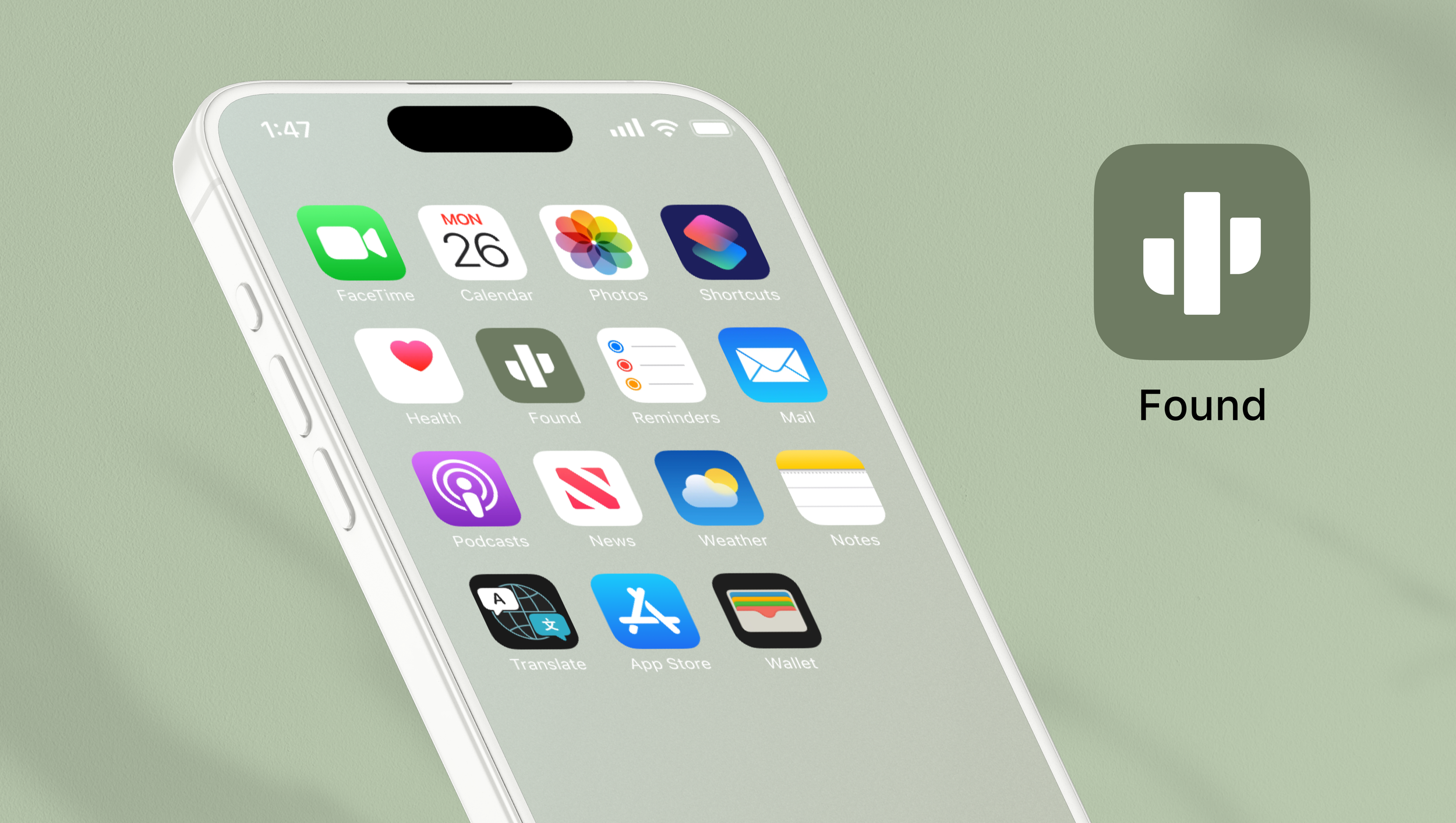
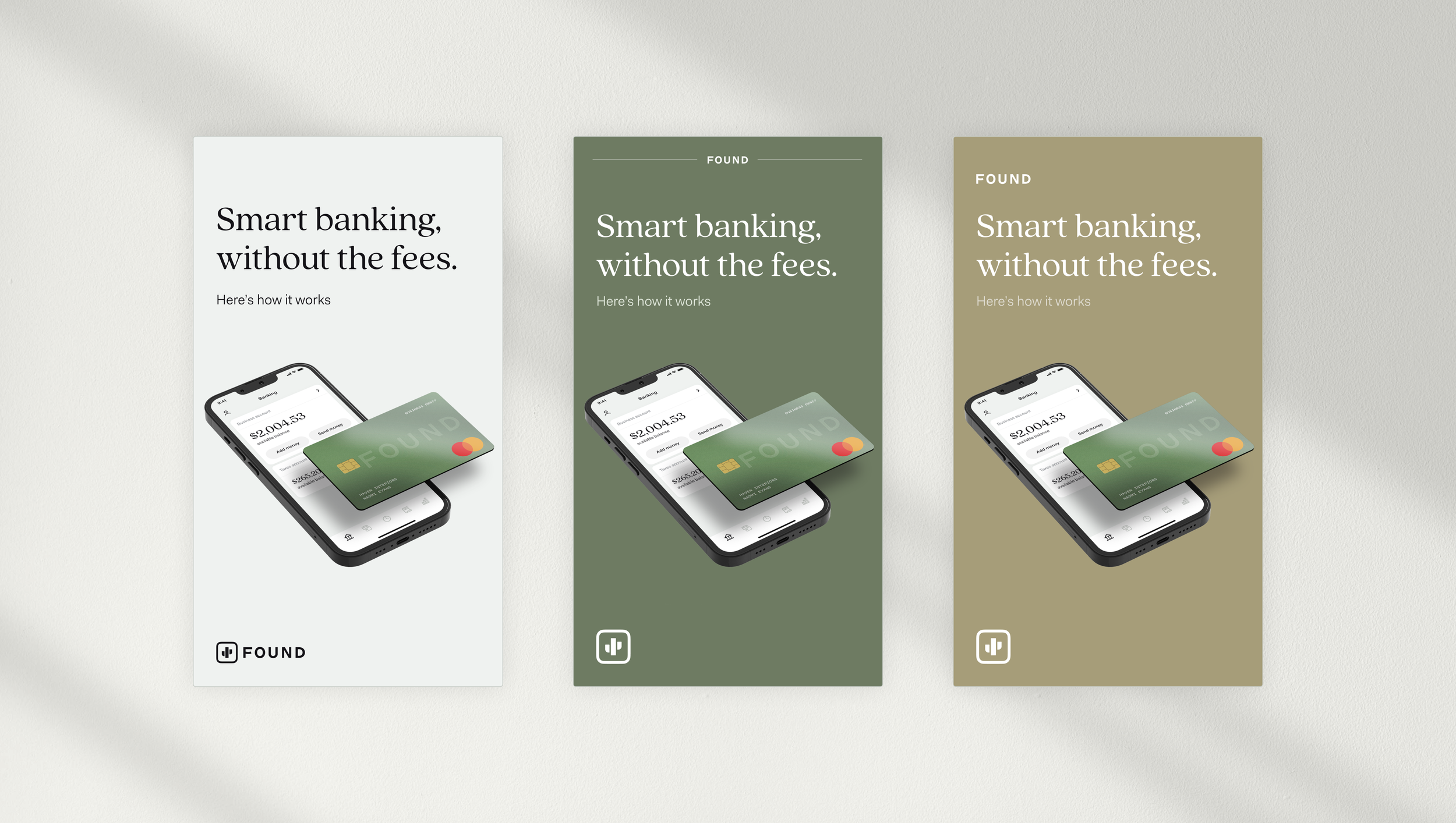
Develop a versatile logomark that is instantly recognizable, emotionally resonant, and adaptable across various platforms. The new mark should embody the brand's core values while evolving the color palette to create a distinct visual identity.


What People Are Saying
“I believe small business owners can benefit from it. Also the UI/UX and branding are impeccable.”
— Score 10/10 crissy@rathergauch.org
I love everything about the brand. Both form & function”
— Score 10/10 562 667-9264
“Easy to use. Love the auto tax transfer and multiple accounts. Visually pleasing. Clean cut, easy design.
— Score 10/10 OrigonlLula
“Great brand and app execution”
— Score 10/10 Rik C


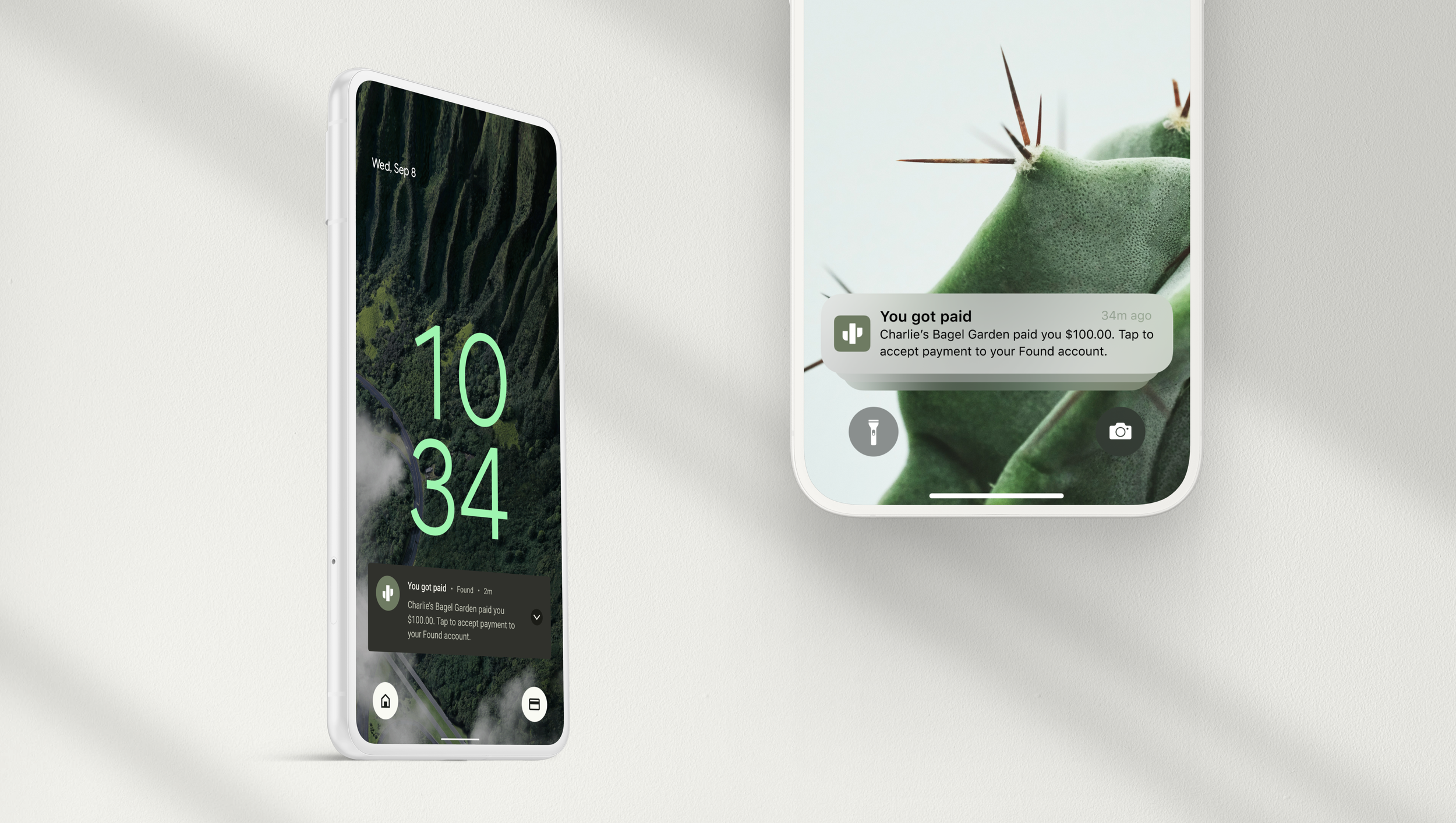
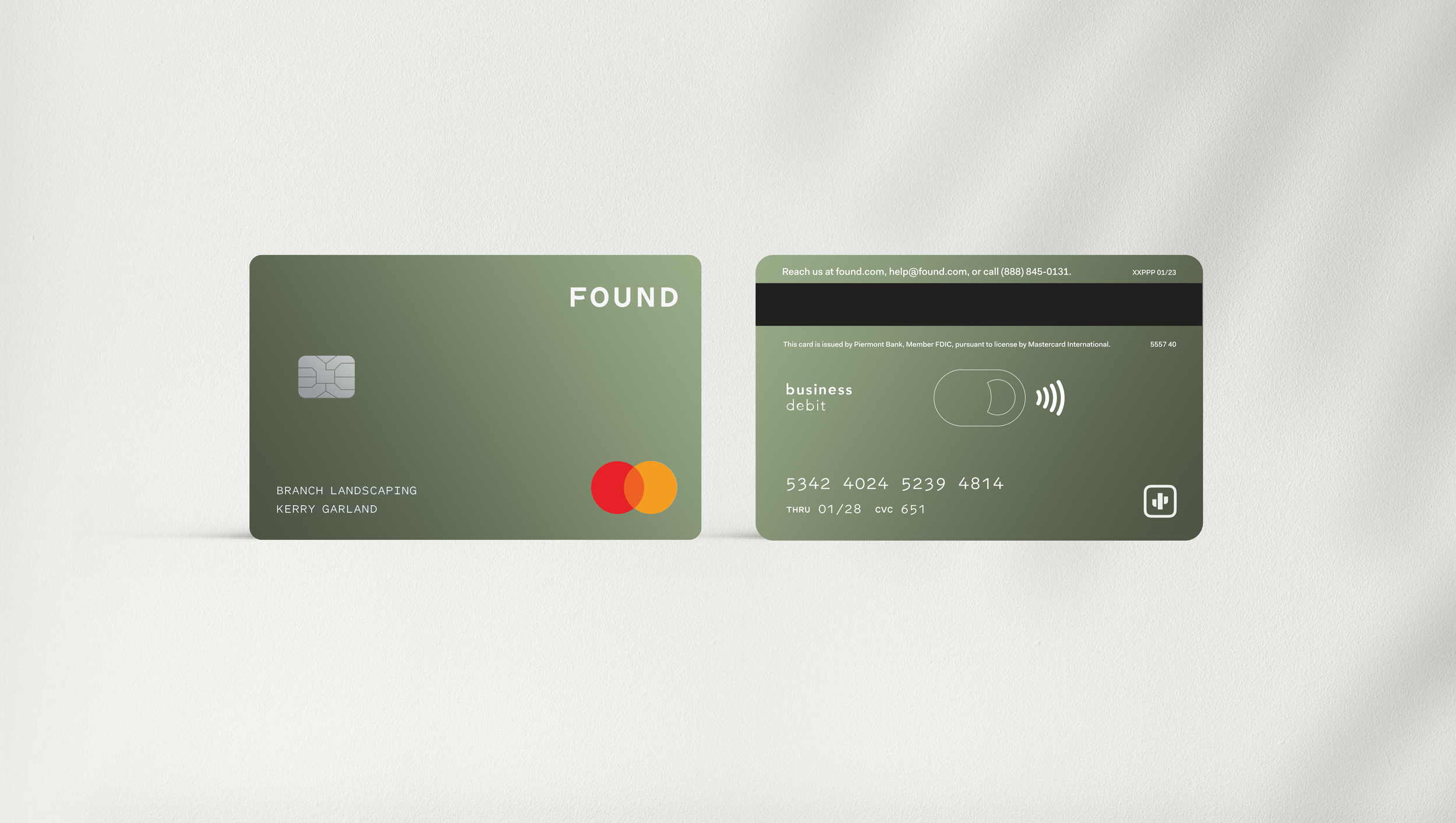

Impact
A stronger, more memorable brand mark will enhance brand recognition, drive customer loyalty, and increase brand equity. This will ultimately lead to improved engagement and reduced marketing costs.


Role
Product design, brand identity, brand experience
Collaboration
Cathy Bishop, Robert Murdock, Lauren Myrick, Shayne Sing, Patrick Smith